Launching UX at an Industrial Tools Company
Enerpac is among the premier manufacturers of heavy industrial tools powered by hydraulic pumps. But to stay ahead of the curve, they realized they need to focus on good design. I was brought on to the newly created design department to help gain buy in from executives and throughout the organization for the value of UX by doing several short term proof of concept projects.
Overview
UX Intern Fall 2019
Summary of Work:
- Worked with pipeline bolting engineers to help refresh a calculator that they use to find loads on the pipelines.
- Developed a configurator to help customers find simpler products on their own to save salespeople's time.
- Helped create an app to help customers track and maintain their tools.
Responsibilities:
- Interviewed stakeholders.
- Created and administered survey to collect mass data on application usage.
- Created artifacts and syntheses of research.
- Created static and interactive wireframes from whiteboard to Adobe XD.
- Tested wireframes with stakeholders.
- Worked with managers and developers to create project management workflows.
The Projects
The Projects
Informate
Informate is software that helps pipeline engineers run calculations on bolted joints of pipelines. This was my primary project at Enerpac. I jumped on the project to make sure it was meeting the needs of various types of engineers, and explore its place in an Enerpac software ecosystem.
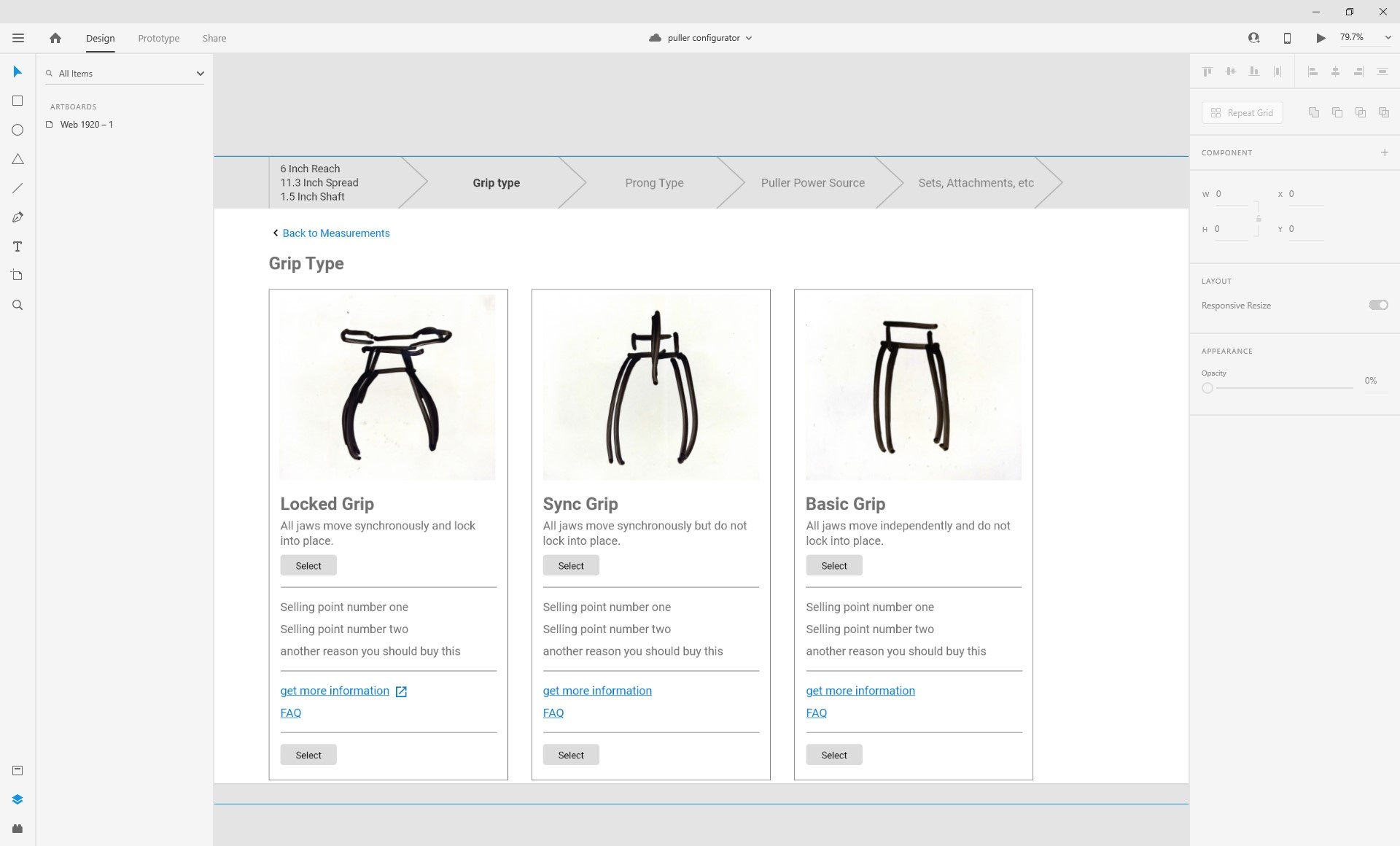
Sales Configurator
Part of my co-op was spending the last month on a personal project of my choice. I decided to work with sales on a product configurator to help customers find the right product without needing to contact salespeople.
Informate
Informate
Bolting Calculation Software
Click and Drag the Handle!
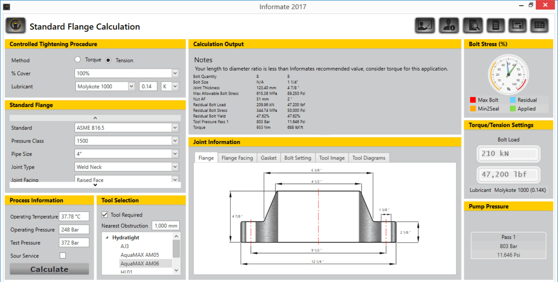
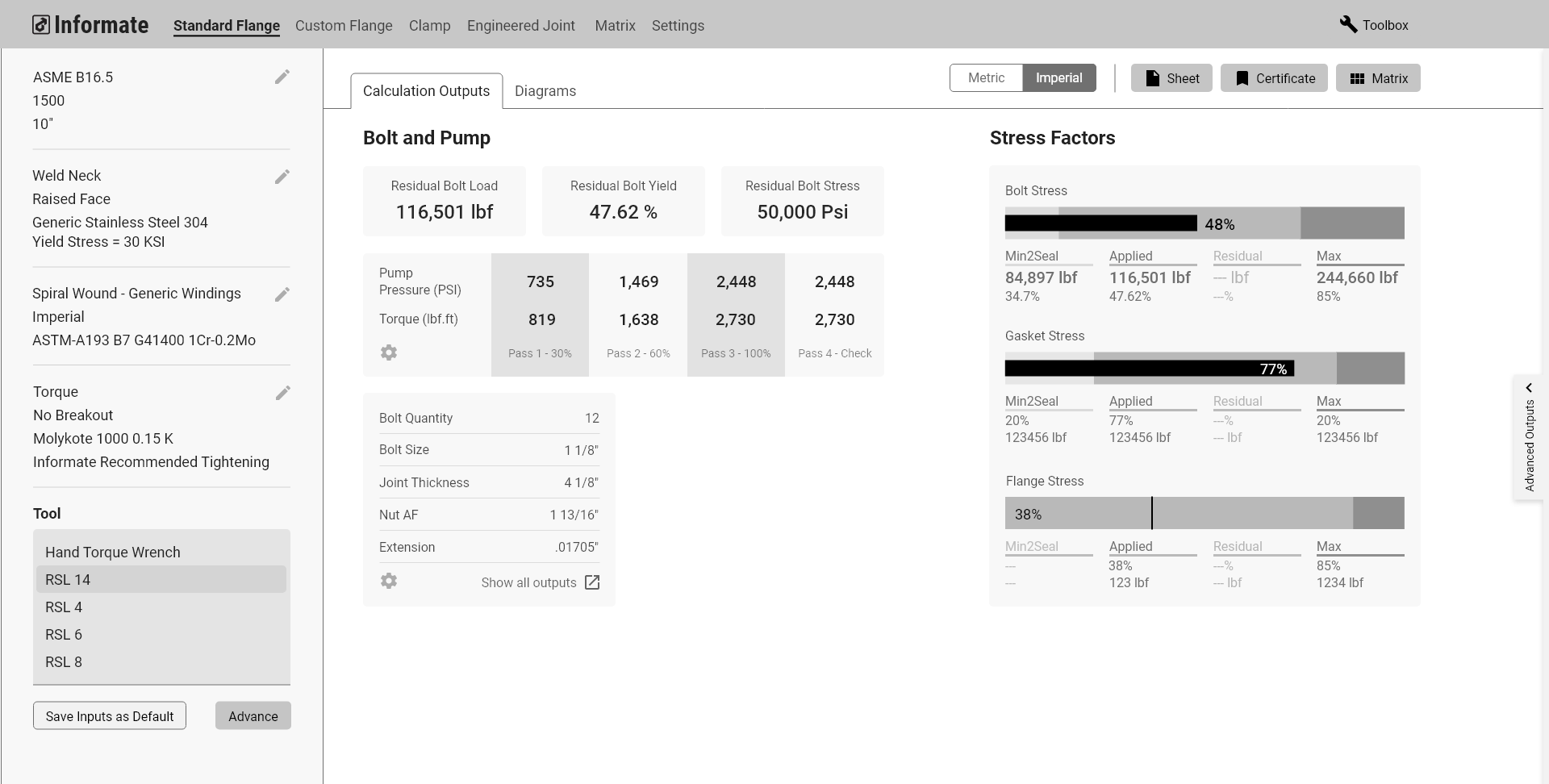
Existing Informate UI vs Wireframed Proposal
Laying the Groundwork
Establishing the Project Goals
Informate is one of the most established softwares that Enerpac uses and distributes. Therefore, it was a natural starting point for the introduction of UX into the organization.
In a kick off with the lead developers on the software, we established what they saw as major opportunity areas for the software as a starting point for any redesigns:
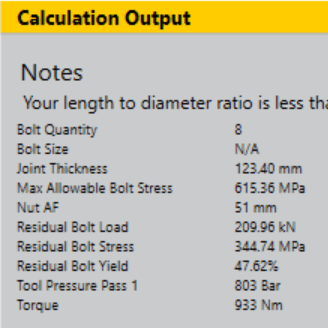
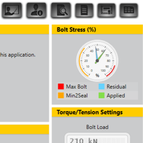
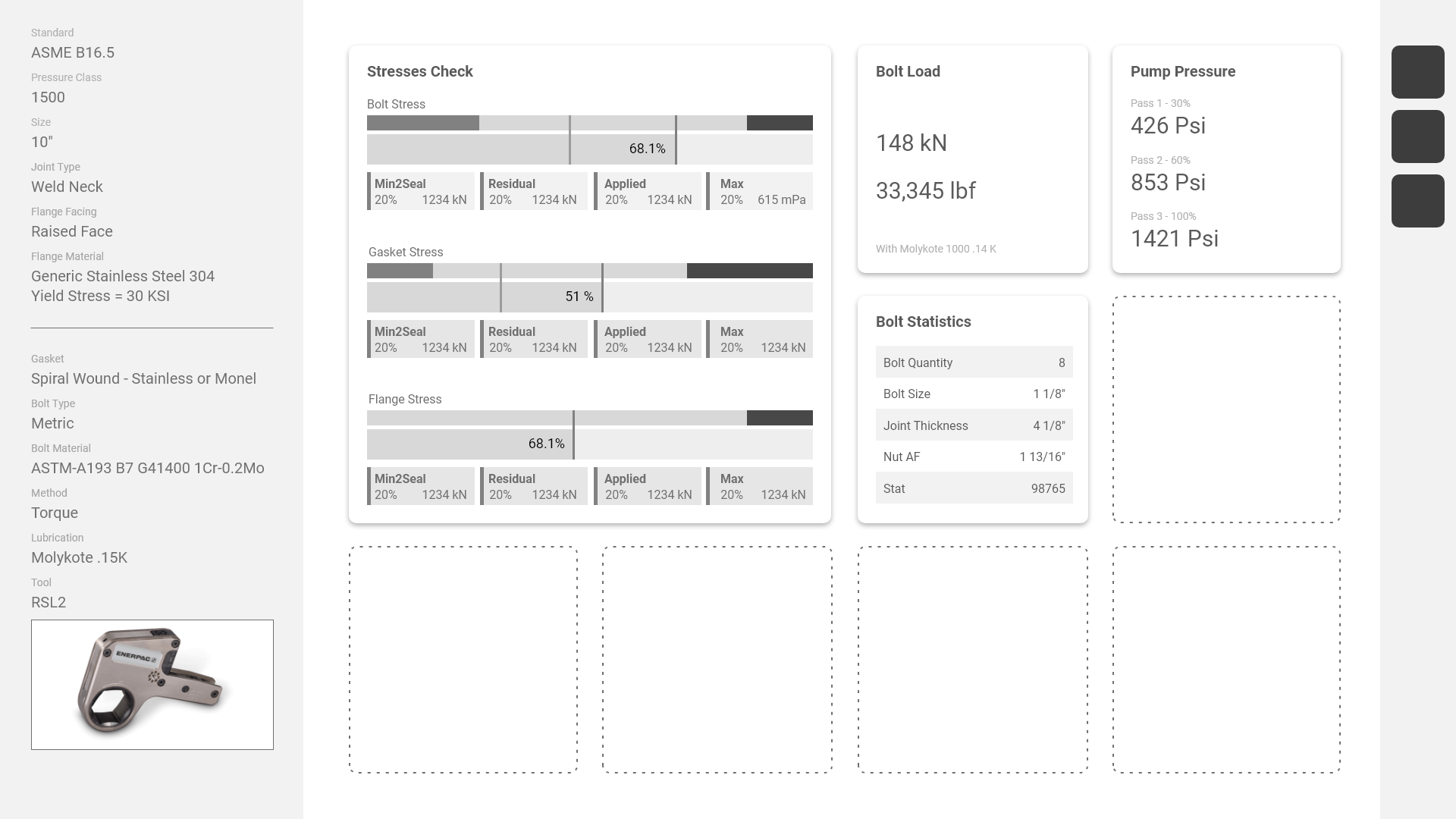
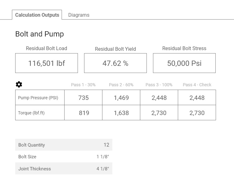
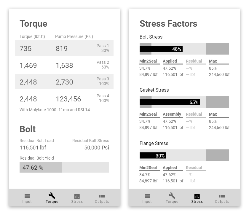
Establish Hierarchy of Data Outputs
Currently many of the key outputs aren't called out to the degree they should be, and data points aren't sorted effectively.
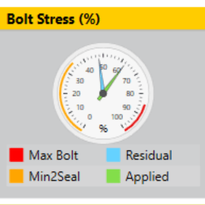
New Data Visualizations
The data points that are called out visually could be called out more impactfully and legibly.
Potential Ecosystem
The calculations done in Informate are useful for planning and organizing, and operations managers need the data. How can that transfer happen more seamlessly, without using PDF outputs?
Interviewing Stakeholders
I began by learning about how different people use the software differently. This meant talking to the consulting engineers who design the pipelines, project managers who plan jobs, operations managers who decide things like what tools to use on the job, technicians who install and maintain the pipelines, and the developers who work on the software.
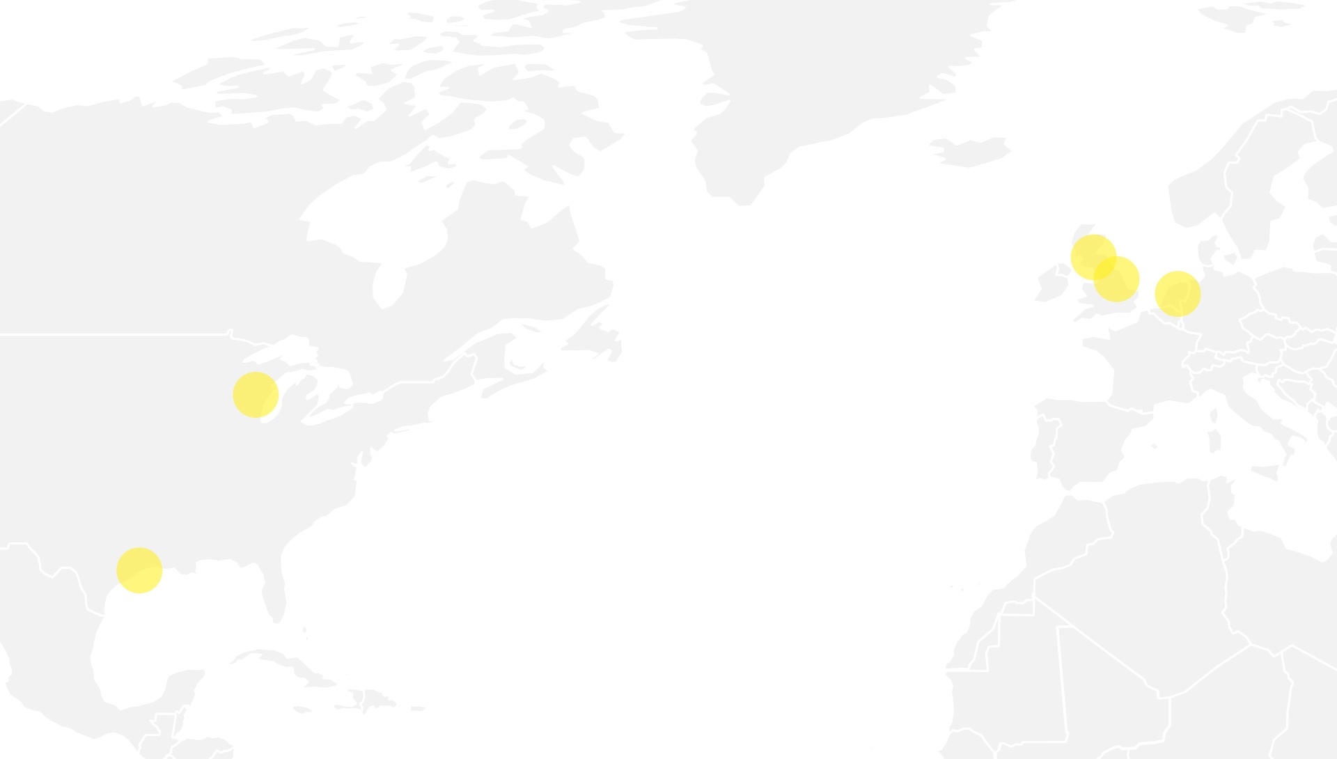
Deer Park TX, Milwaukee WI, Aberdeen Scotland, Morpeth England, Hengelo Netherlands
Digging in to Data
Satisfaction Survey
We ran a survey that was sent out to every registered user of Informate, as well as every registered user of the "lite" version of Informate called BoltUp. We wanted to hear about how users felt about the software, and we wanted to know why BoltUp users weren't upgrading to the full Informate.
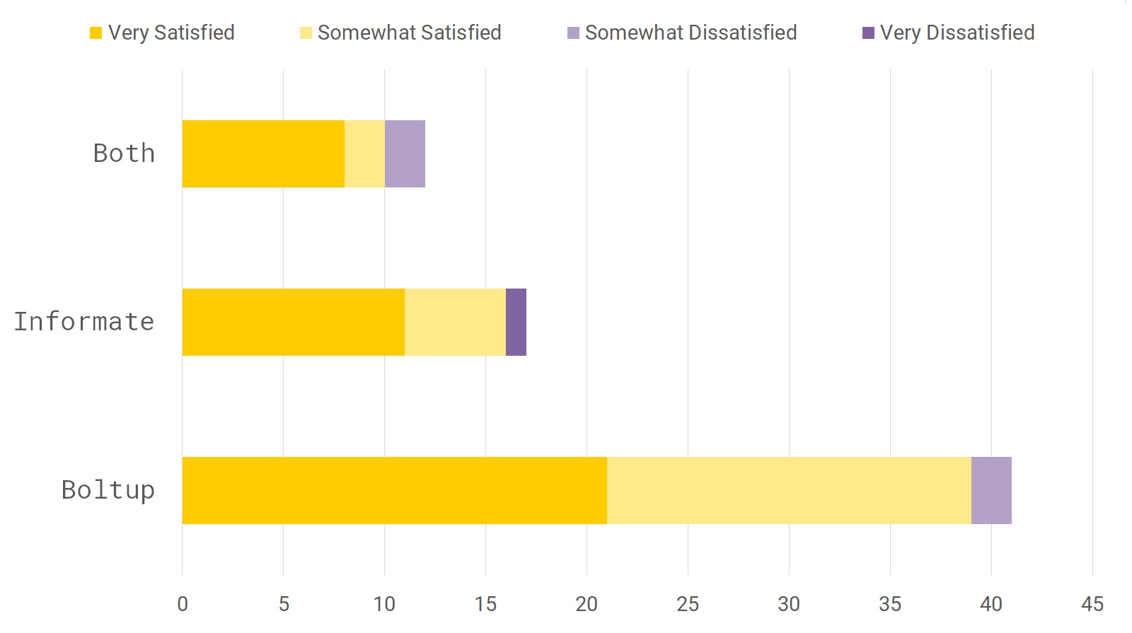
The survey found that a large majority of people who use Informate and BoltUp were satisfied with its functionality. We also found that many BoltUp users didn't even know about Informate. This suggested to us that making a uniformly branded ecosystem was important.
Establishing Key Use Cases
The survey also asked respondents what they got out of the software i.e. what data do they need from running the calculations. We found that the most important information is immediately actionable specifications that are often relayed to technicians, like what torque to tighten bolts to, what tool to use, what pressure to set tools to, and things like that. Using Informate to plan and design joints was more niche.
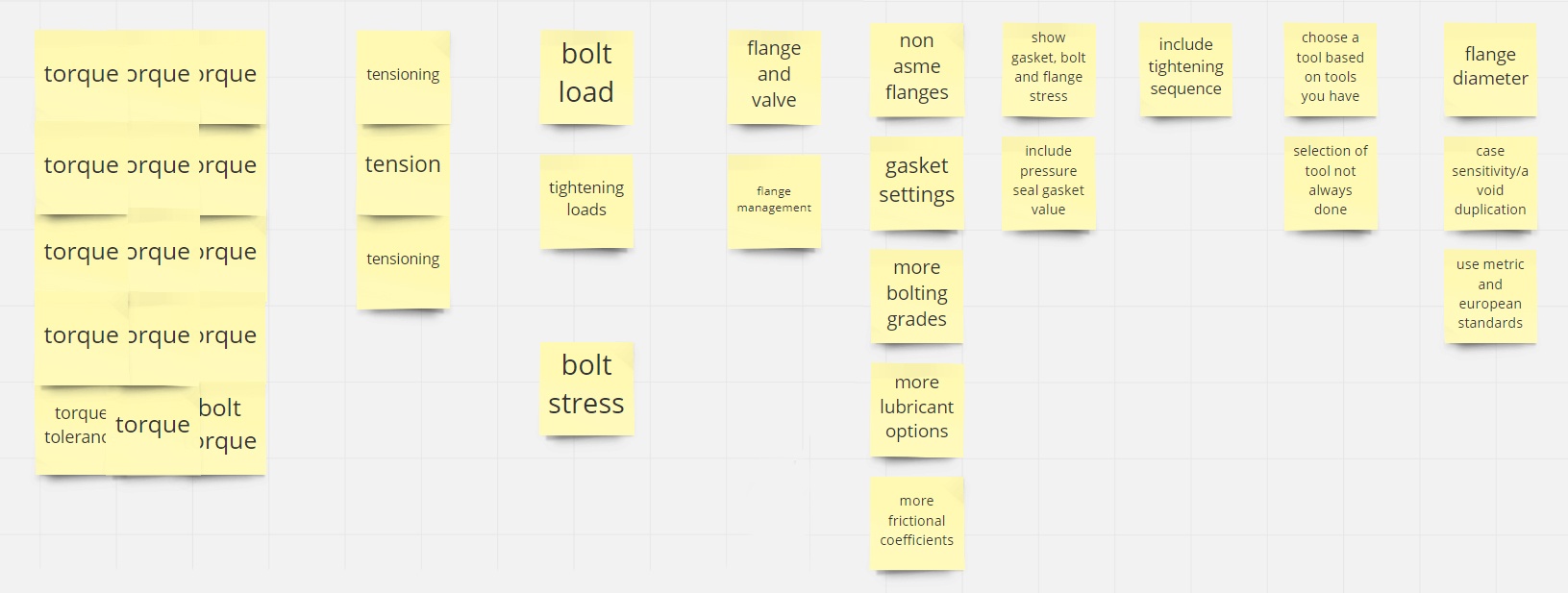
Survey Answers were imported into Miro for affinity mapping
Evaluating the Alternatives
Evaluating the Alternatives
To get a grip on how Informate stacks up to alternatives, we conducted a competitive analysis on other bolting calculators in the market, such as iBolt, Asset 55, Hytorc Flange Calculator and more.
We also asked engineers how they would do calculations without a calculating software. We found that many engineers have created their own spreadsheets and macros to do calculations just to double check results and assure their clients on the validity of the calculations.
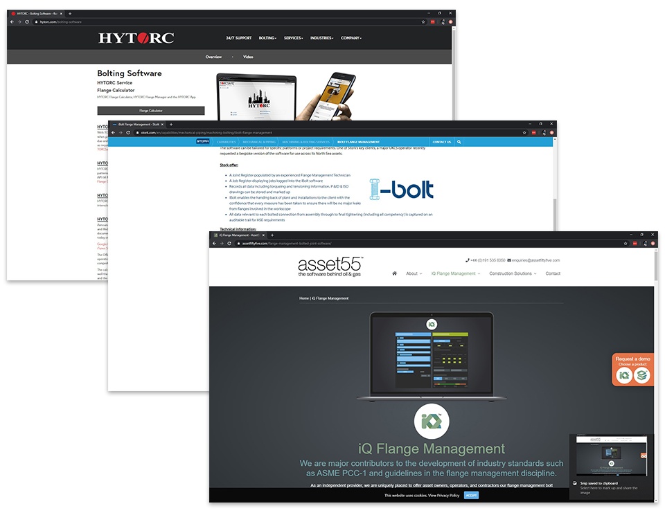
Looking into competitors
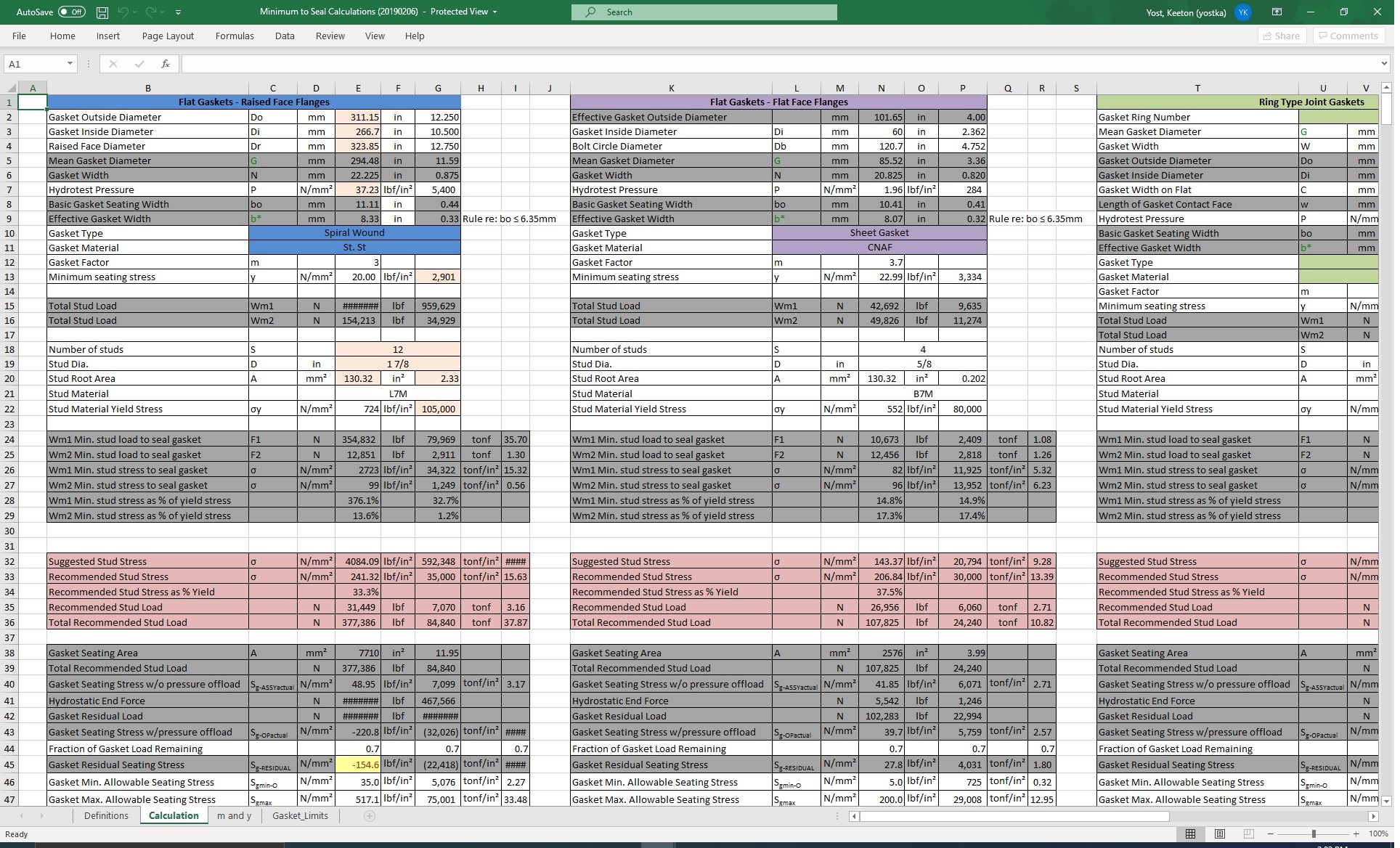
An example of an excel sheet used to calculate bolt loads
Design Priorities
The Plan for Informate
Highest Priority
Desktop Refresh
- Refocus on key data points and outputs found from research.
- Propose new data visualisations
- Don't make jobs harder
Building on that Foundation
Mobile Rebrand
- Rebrand BoltUp as Informate Mobile, to unify the ecosystem and make sure people know about the full software
- Next step is talk to technicians to find out how the software can serve them on the job
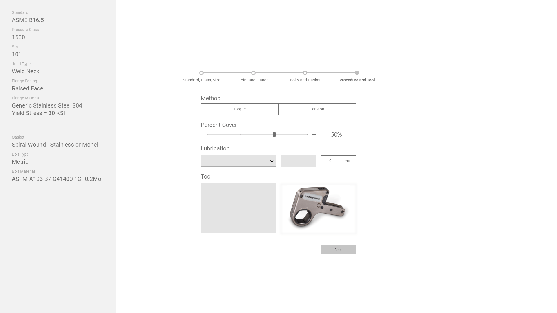
Visual Wireframing
Desktop Refresh
First Drafts
First attempts at redesigns were base explorations into the focus areas, like data-vis and highlighting key statistics.
"Wizard" guided mode
We also experimented with a guided "wizard" mode to step through data input. Ultimately, engineers found this juvenile and slow: they are highly educated and can compute these calculations without software help, they don't need a step by step guide.
Build Your Own Dashboard
We also experiemented with a customizable dashboard since many different roles need different statistics. Ultimately we thought this was unlikely to be implementable, and also failed to meet the goal of establishing a hierarchy of data outputs.
Collecting Feedback
Since the team is distributed through the US and Europe, we shared wireframes with engineers and stakeholders using Adobe XD's cloud functionality. This allowed asynchronous feedback and helped collect everything in one place.
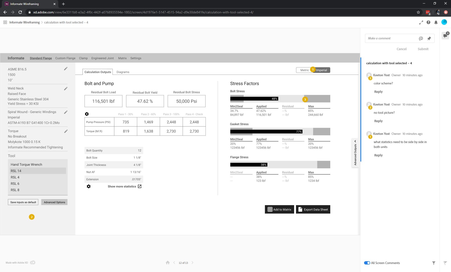
Proposed Changes
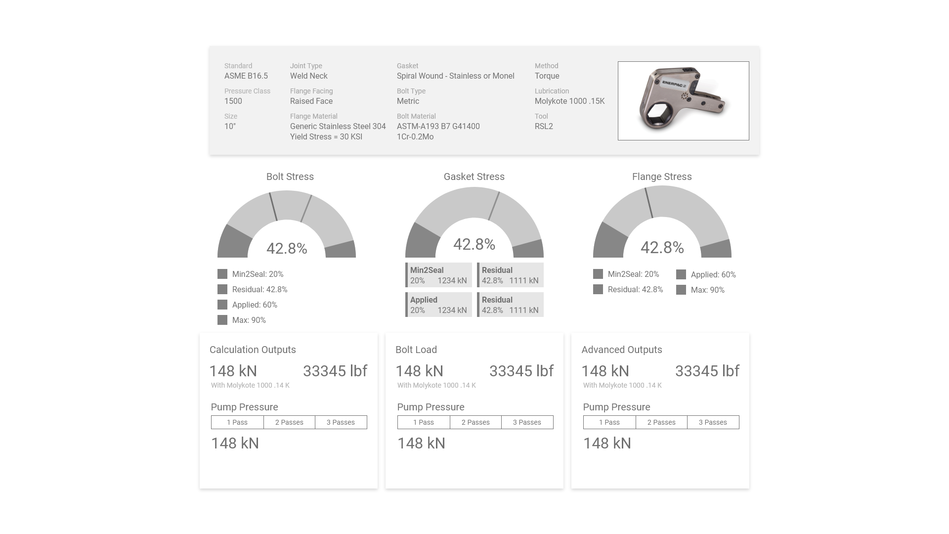
Click and drag the bar to compare existing Informate UI vs wireframed proposal
Most valued data points are heavily prioritized
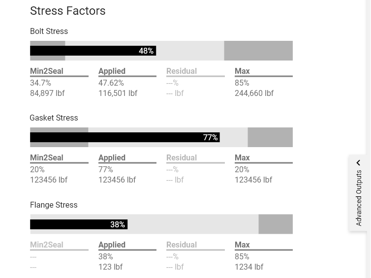
All stress factors are visualized, and blank gauges are replaced with labeled bullet charts
Form is re-ordered so most determinant questions come first, and alternative inputs were explored
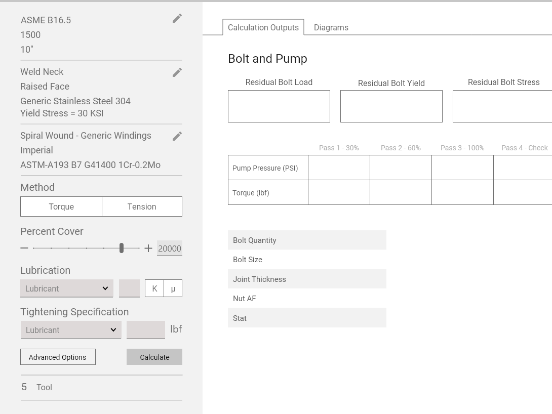
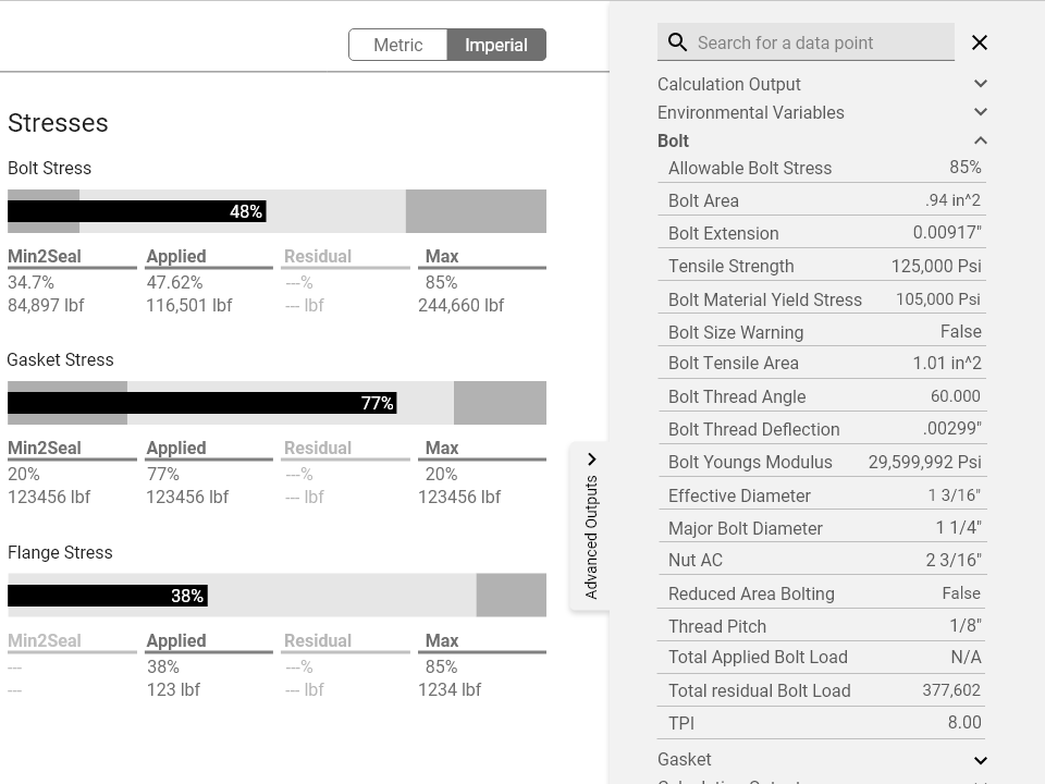
Advanced outputs are always available and searchable in a sidebar, rather than in a pop-out
Next Steps
Mobile - Phase Two
We were able to start some wireframes for Mobile, but many of the stakeholders who use mobile like Technicians were unavailable for feedback so it took a backseat. The next step would be to interview them and get their feedback to improve the mobile experience.
Feasability for Devs
Since UX is so new at Enerpac and there were lots of changes going on, a real team for development couldn't be spun up before the end of my internship. The next step would be getting more developers involved to make sure proposals were executable.
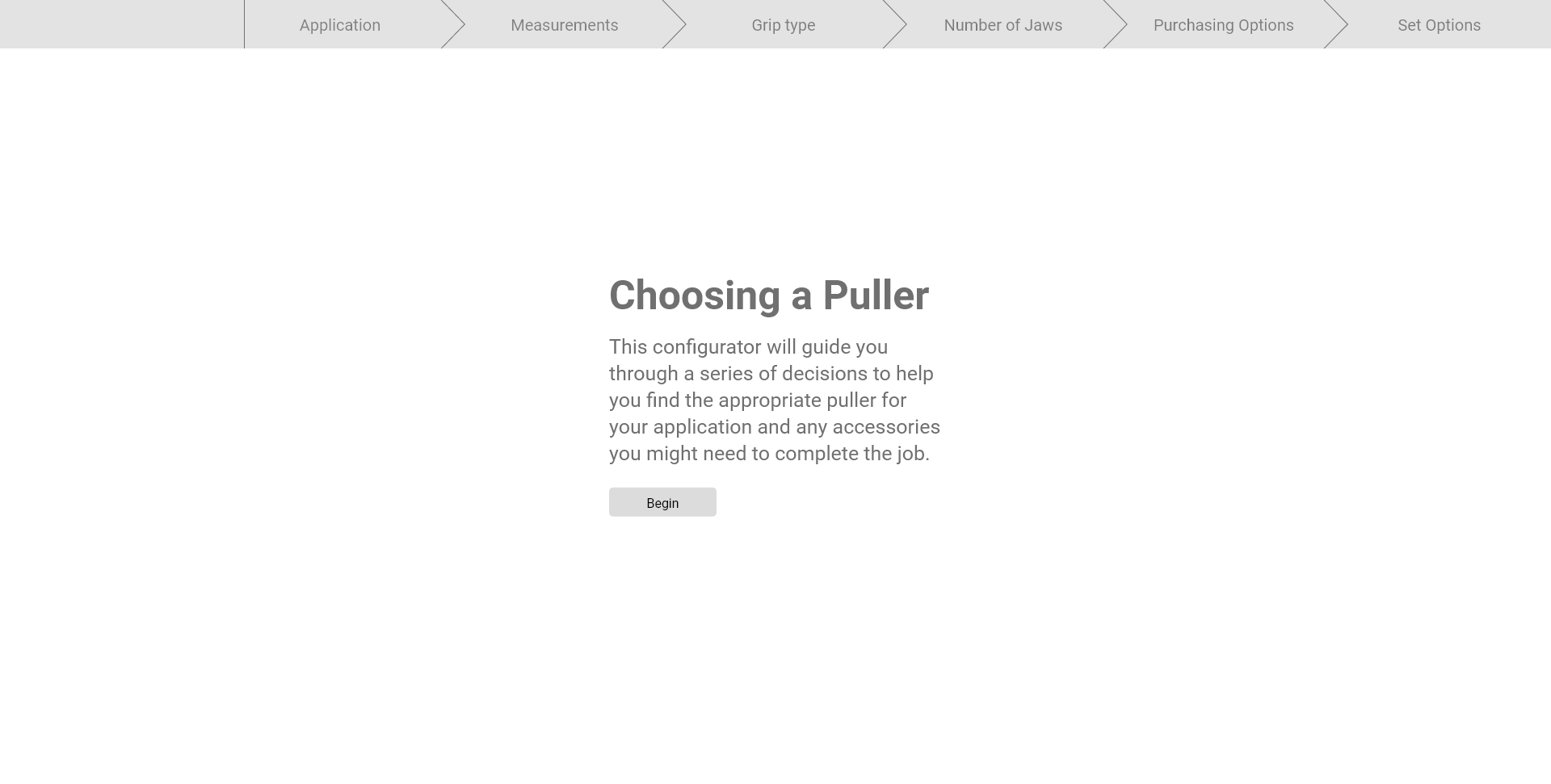
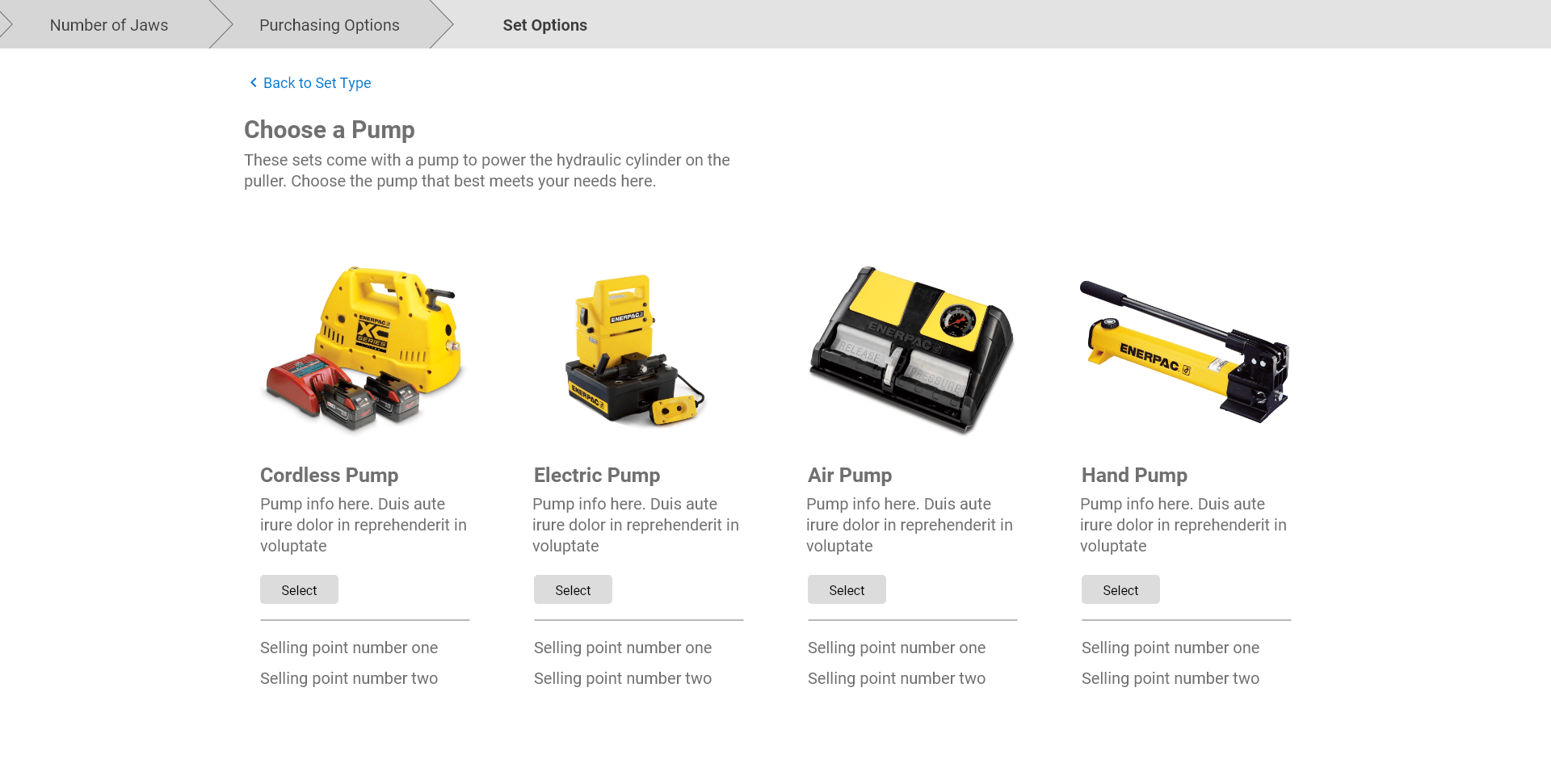
Configurator
Individual Design Sprint
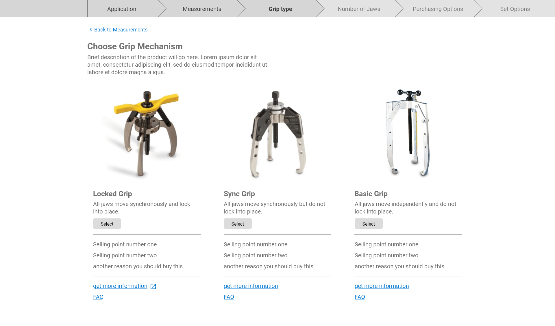
My Personal Project
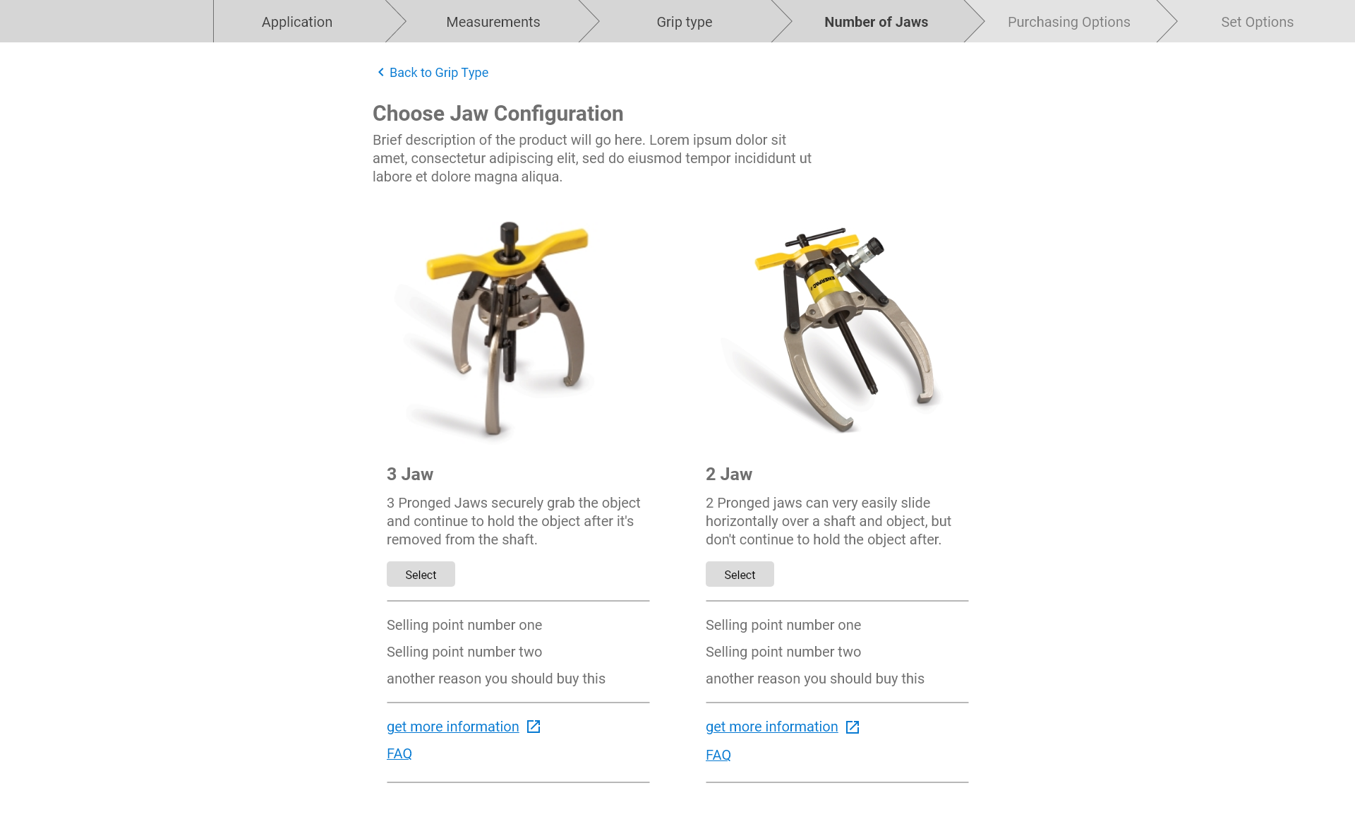
The last three weeks of my internship was reserved for a self-chosen personal project/design sprint. I talking with different departments and managers in Enerpac to identify a blue sky need somewhere in the company, and decided to work with sales on a product configurator for pullers. (Pullers are tools which grip objects stuck on shafts like wheels or bearings, and have a central cylinder to push the shaft down off of the object.)
Helping Customers Help Themselves
The Current Customer Experience
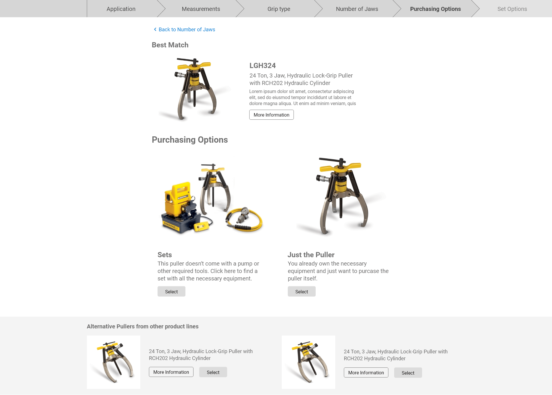
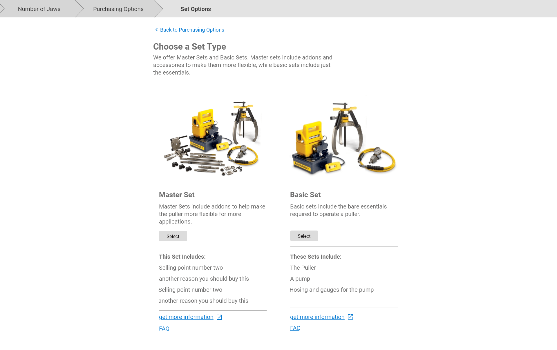
Pullers are among the simplest tools Enerpac sells, but they have many options for kits and accessories. Because of this customers still have a hard time finding the exact tool or kit to order. Sales then has to help them find the right tool, which takes up a lot of time on low revenue, low volume sales.
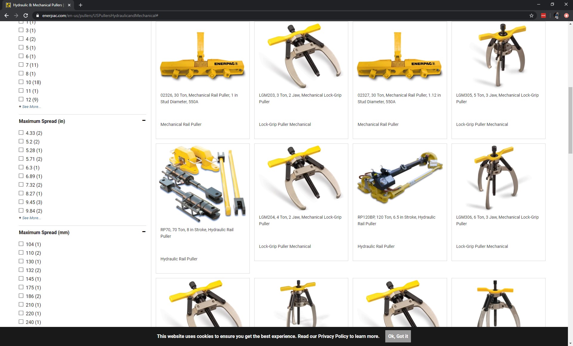
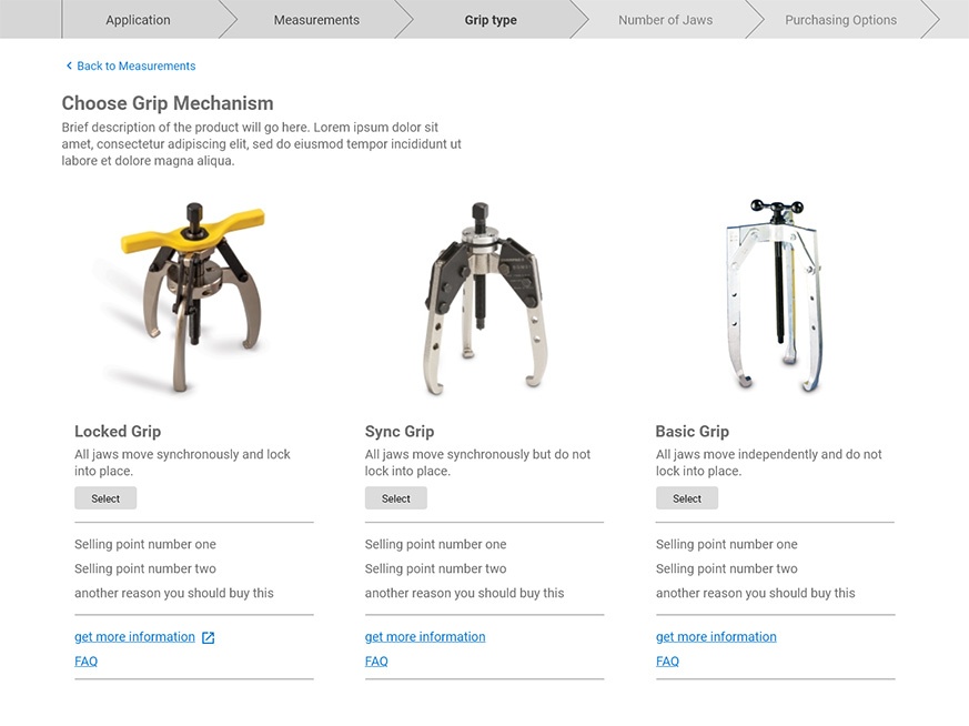
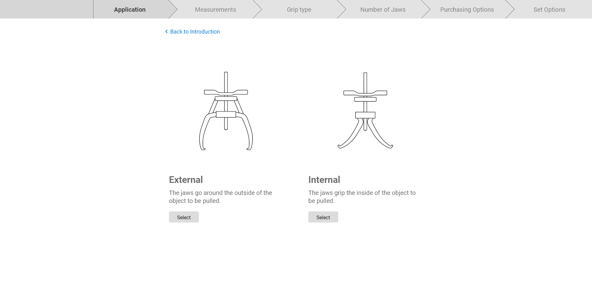
How to Choose a Puller
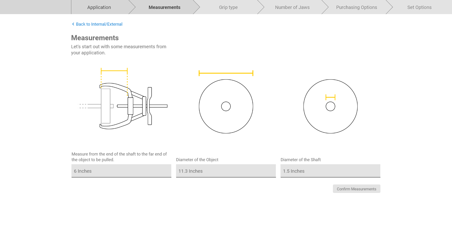
Pullers are simple tools at heart, so finding the right puller should be very doable for most customers if they know what to look for. A majority of the time, a customer will know a puller will fit with only three measurements:
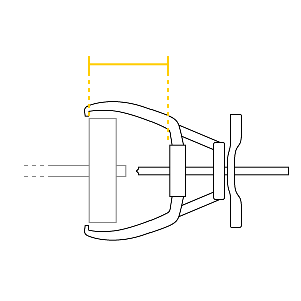
Reach
i.e. how far down the shaft does the puller have to reach to grab the object
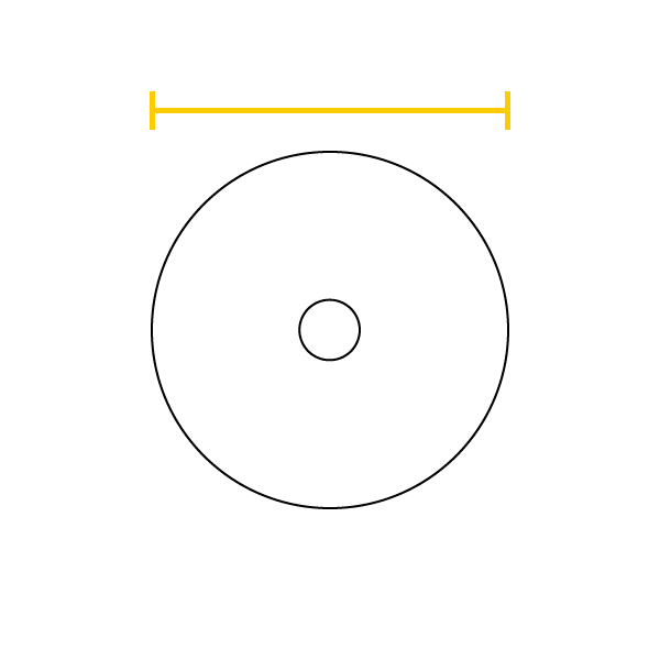
Diamater of Object
How wide do the puller's jaws have to open to get around the object being pulled?
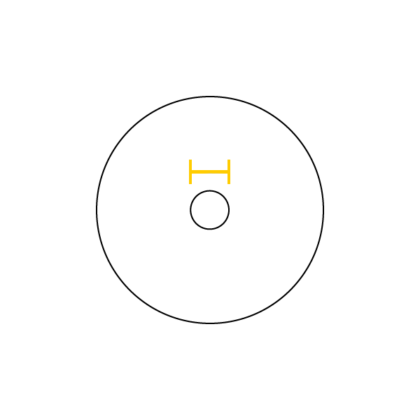
Diamater of the Shaft
Make sure the puller will be able to push the shaft, and helps determine the amount of friction and therefor force required
Once the customer has established these measurements they can be almost certain the tool will match the job, and they only need to choose the product line and accessories.
Collecting Feedback
Shared Wireframes
Once again, I used Adobe XD to share out wireframes with stakeholders. This time I sent it to sales managers, regional managers, distributors and product trainers who deal with pullers. I also asked them to send the wireframes out in turn to customers who buy pullers.
Prioritizing Comments
Since the wireframes reached a breadth of roles, I needed to make sure I was following feedback that actually represented customer reactions. Therefore, I prioritized the feedback by who was either a customer themselves or worked directly customers on a regular basis.
Results

Click through the gallery to see the flow
Next Steps
Since this was an individual, speculative project there are no plans or means for implementation. But the project had good reception, and put this possibilty on the radar for sales. It also helped create buy-in for UX in a new department of the company, which was one of the overarching goals of my internship.
What I learned at Enerpac
Heavy Self Guidance
I've always had individual responsibility at my internships, so it wasn't a surprise to manage my workload and my schedule. But this was the first time I was the only UX designer in a company, and also the first time I was part of building a design team. This forced me to become much more aware of the process and administration that is required to run a successful project. There was a signifigant learning curve for me in this new environment, and because of that I am more equipped for the future.
A New Industry
I also have mostly worked in the tech space on fully digital products, with the exception of one internship working on consumer goods. Working on heavy industrial tools meant for heavy construction, not consumers, was a whole new world to work in.
Opportunity of Physical UX
Although I didn't get to work on physical interfaces during my time at Enerpac, we as a design team talked a lot about how UX could fit in to the physical interfaces present on many industrial level tools, and how that opportunity is very neglected in the marketplace as a whole. This is an interesting space for a UX designer with education in Industrial Design like me.
Check out more of my work: